
8 ans d'expérience sur 2 pages A4
Pour les conventionel∙les et les procédurier∙es, mon CV est dispo là, en échange de ton petit mail 👉


Pour les conventionel∙les et les procédurier∙es, mon CV est dispo là, en échange de ton petit mail 👉
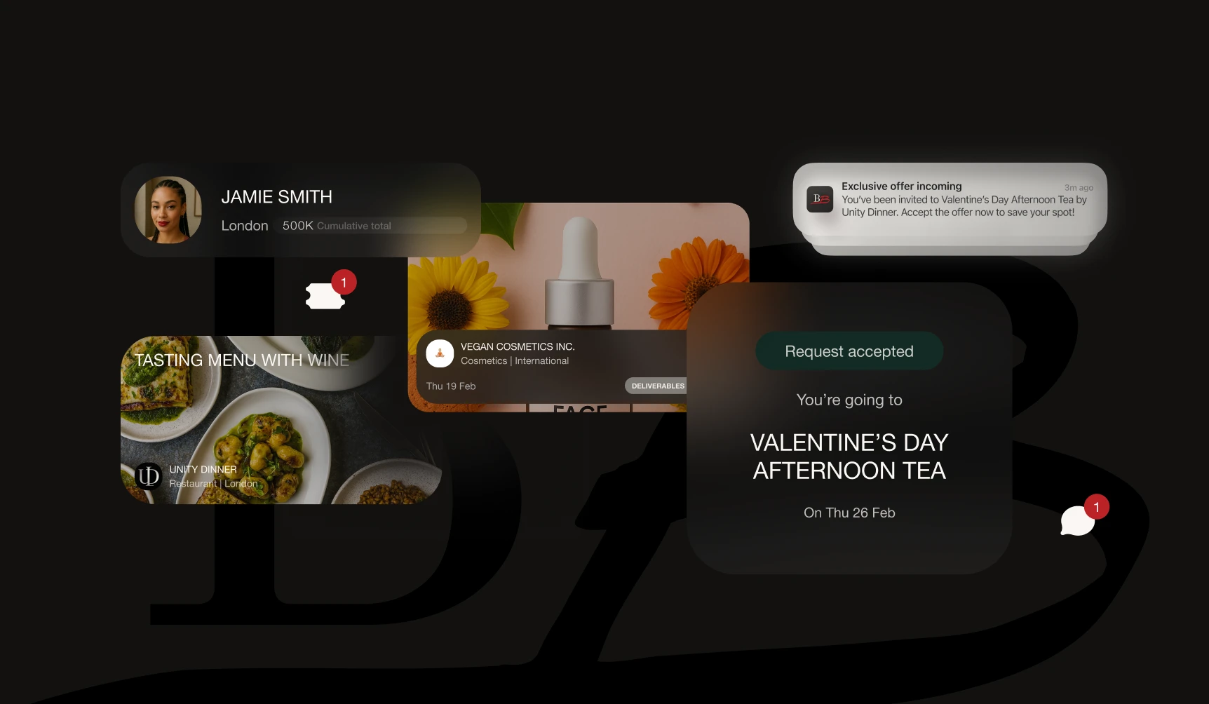
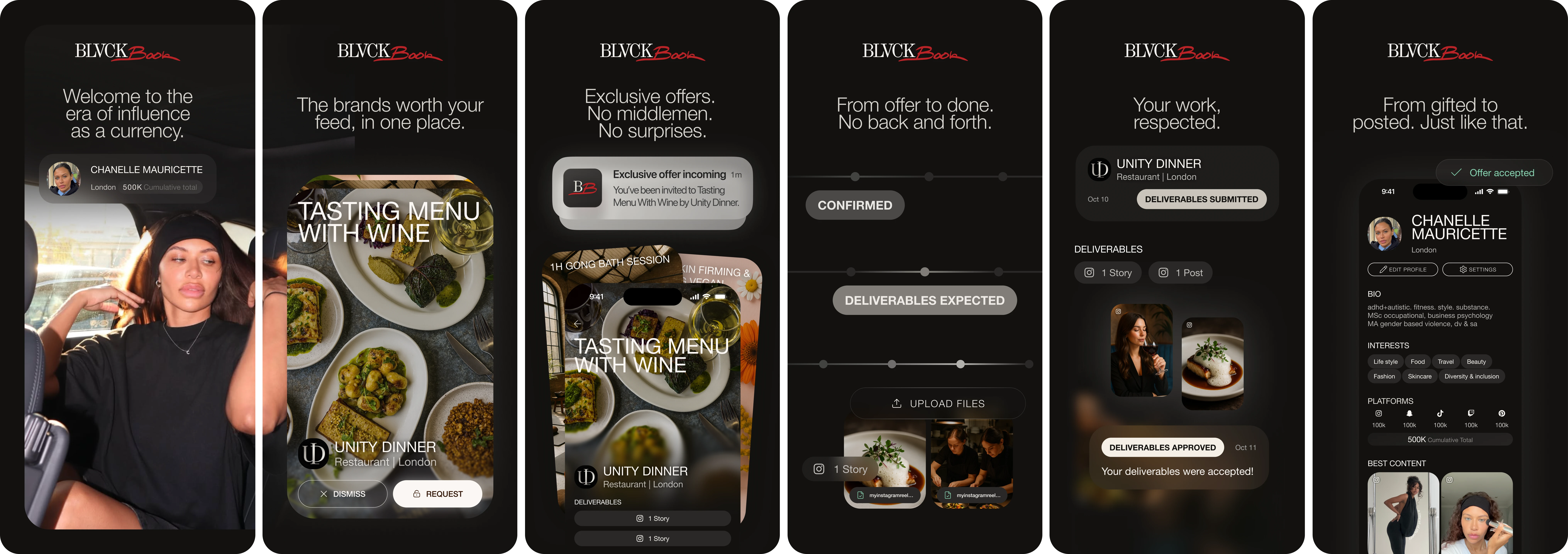
Influencer marketing in the UK runs on spreadsheets, email threads, and WhatsApp voice notes. Chanelle Mauricette, BLVCKBOOK’s co-founder, lived this firsthand as both a content creator and a social media agency owner, watching gifting collaborations collapse under weeks of manual back-and-forth with no infrastructure to hold them together.
Existing platforms either catered exclusively to mega-influencers, locked creators into frustrating credit economies, or ignored the UK market entirely. Nothing was built around the operational reality of mid-tier creators and the brand managers trying to work with them.
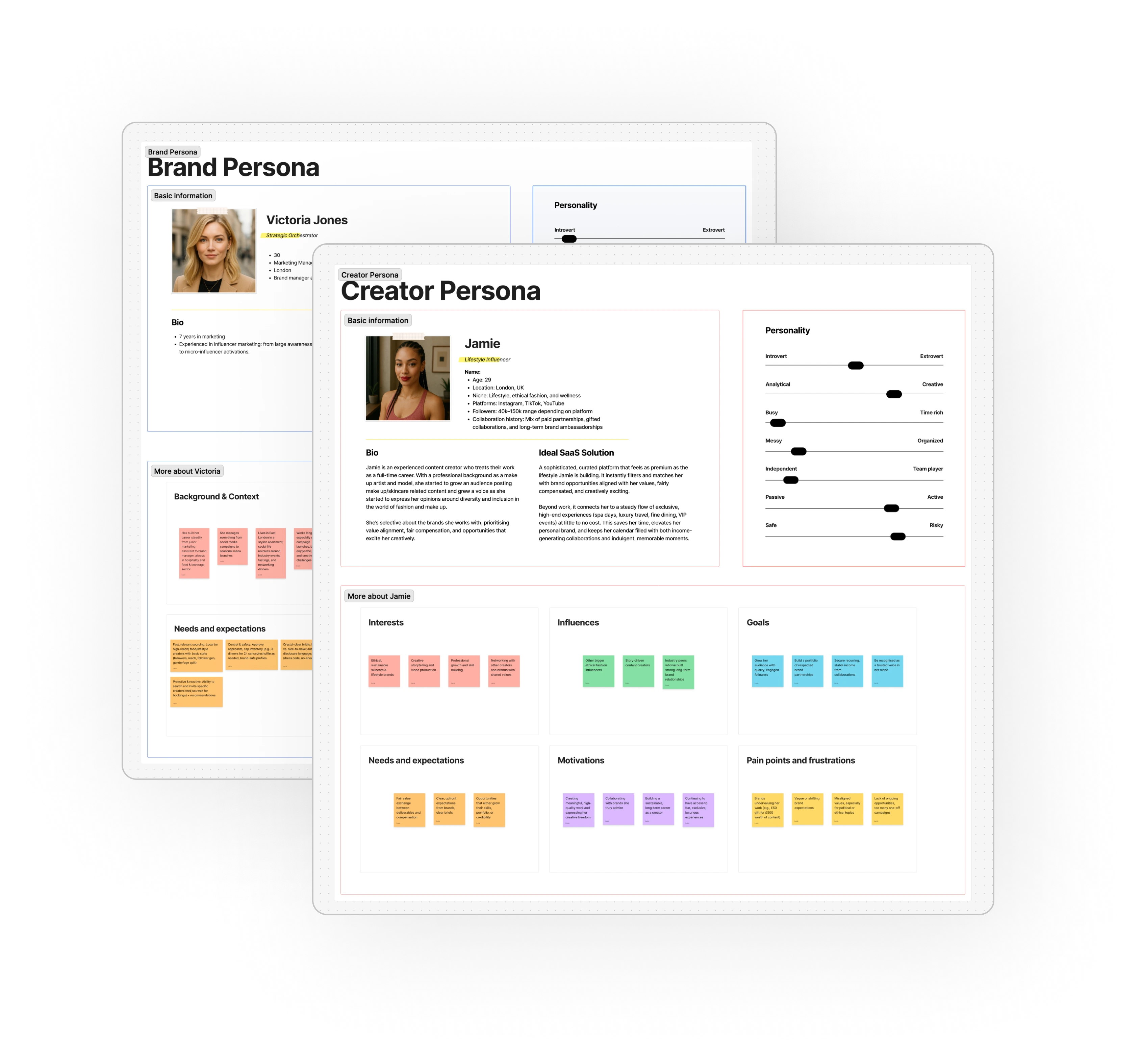
I was brought in to figure out how to solve this problem and bring a really useful, addictive product into the hands of internet creators, arguably the most exciting, but also the most difficult, people to design for. With no budget for external research and no existing product to test, every insight had to be earned. So I ran interviews with 3 creators and 3 brand managers and small business owners. Extracting their frustrations, I discovered that creators are people with very high expectations, low attention span and they can literally make or break a brand’s reputation with a single review. I translated both sides' frustrations and insights into the product's first PRDs, Jobs-to-be-Done, user stories, and information architecture.
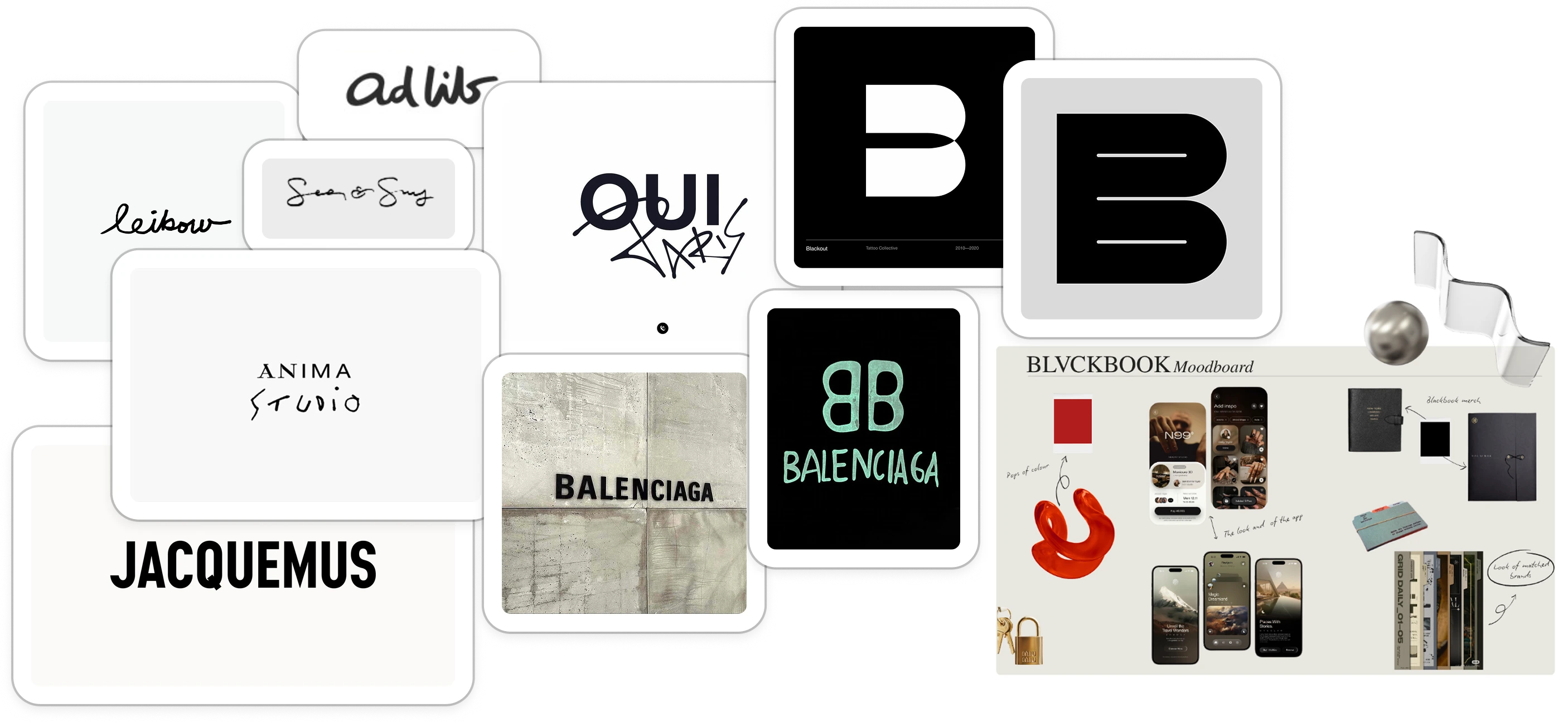
We want to be seen as creators partner in success, made by and for them. BLVCKBOOK is the app that empowers every talented creator to grow their career. That’s why our colour system made of deep blacks, soft cream whites, editorial whitespace, with one red accent reserved for key delightful moments, which purpose is to serve as a frame for the creators beautiful imagery. Unlike competitors, our app’s edge is curation. BLVCKBOOK can be seen as a private club where only the top 1% creators get in. For our brand clients, it is a guarantee of future success for their UGC/influencer campaign. So to represent this selectivity/exclusivity, we designed the app dark-theme-first. We also wanted to tell a story of contrast between chic/couture and a more street/urban vibe, the hybrid logo with hand-drawn and serif letters was born from this idea.
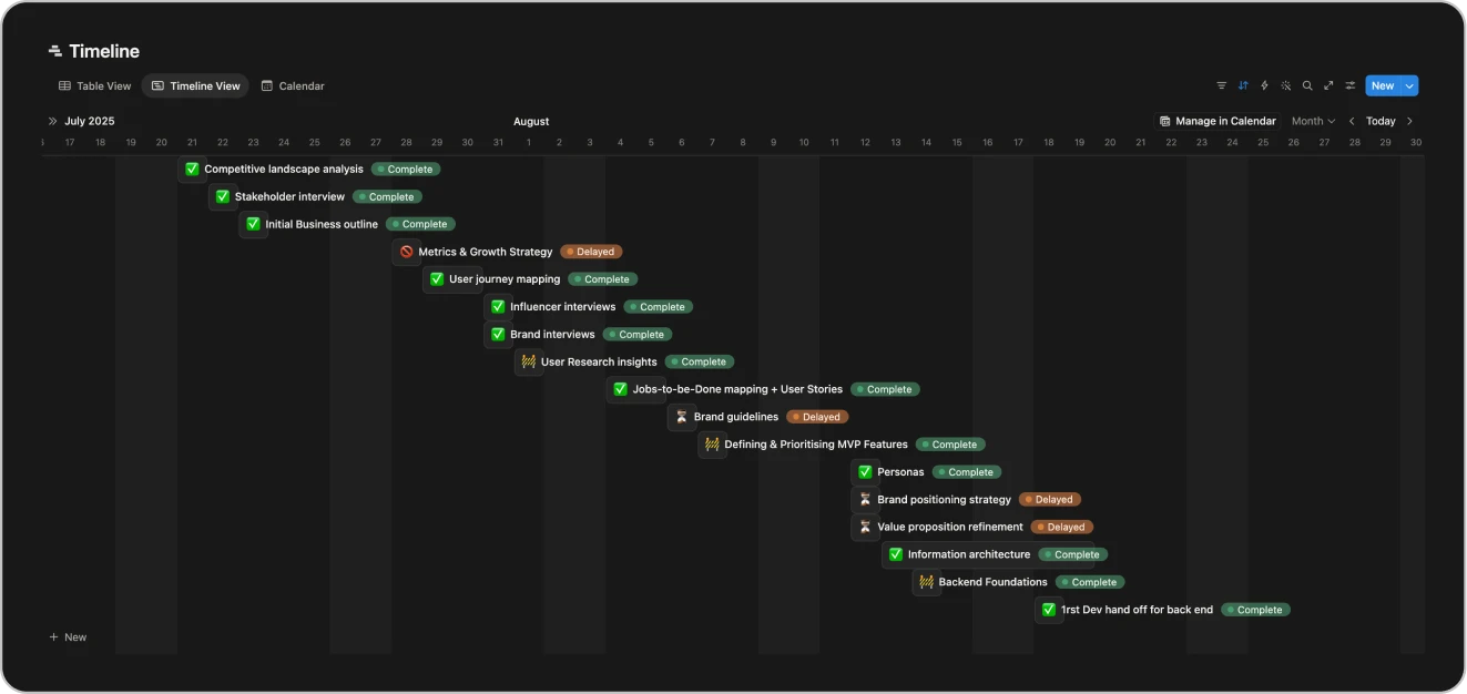
About the way I collaborated with the dev team. I put in place frequent catchups, presentations and weekly rituals to encourage communication and information circulation across different teams. But mid-project, I also got to understand how the developer worked on a human level and had to adapt my system.
The team-wide presentations that I was giving on the design progress were a way for me to ask for feedback, but I realised later in the project that it was important for me to create opportunities for 1:1 exchange moments with the developer in order to get his input on the components I was designing. Once the change was made, we avoided 90% of bugs in the app because I was straight away designing components that were working with the library we were using and we increased delivery velocity by 20%.
Three months in, the business model cracked. The original MVP ran on a credit economy: creators received digital tokens weekly and spent them to unlock brand collaborations. It felt intuitive on paper. In practice, it was a trap. Legally, a pseudo-currency exposed the startup to HMRC compliance risk around taxable gifting. Behaviourally, creators were hoarding tokens out of loss aversion, killing transactional liquidity.
We had to rethink the key user stories and flows. In roughly 2–3 weeks, I redesigned the architecture end to end: monetisation, onboarding and user psychology, and moved from a credit economy to a flat-fee subscription model carried by the pro users only. Basically, we shifted product restrictions from the creator side to the brand side: creators would have unrestricted access, brands would be capped by active deal volume. Creator quantity and profile health became the platform's most protected asset.
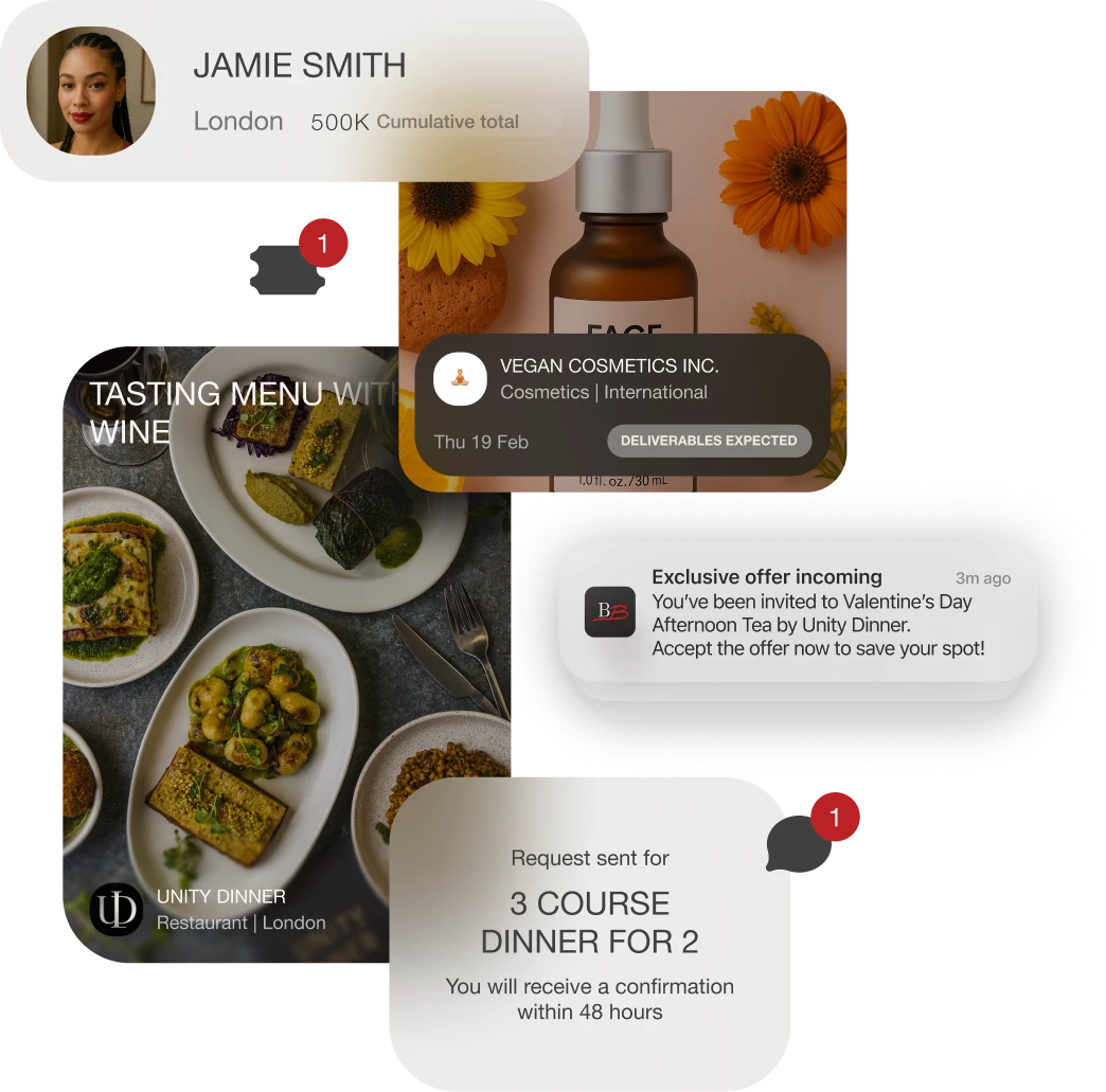
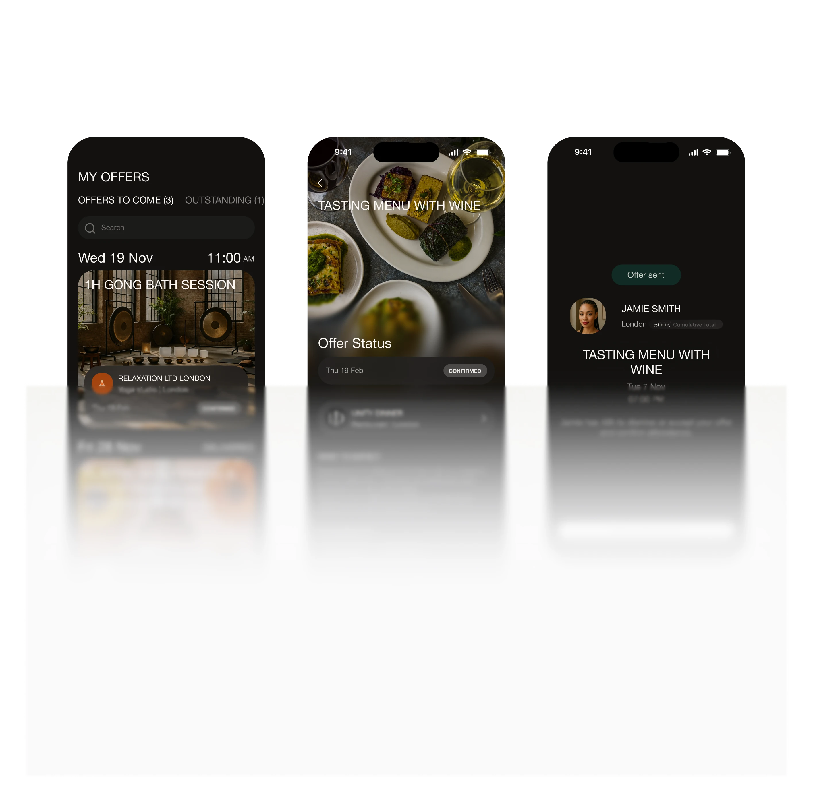
BLVCKBOOK will be a Product Led Growth product. In its DNA it’s a consumer app which will work because it will support a sizeable but not huge base of creators and brands, given our exclusive model. But because no one wants to show up first at a party with no vibe, it’s important that we gather the first 250 pioneers who will set the vibe and start exchanging value. In this context, to help our founder sell our product to its first pro paying customers, I spent some time crafting a compelling marketing message and designing a striking pitch deck that really helped our CEO sell the product and onboard our first clients. I also designed a staged prototype that our CEO used for demos. Between the deck and prototype, we managed to reach a ~70% conversion rate over weeks (not month) long sales cycles. We are now definitely on track to reach our 250 first users goal.
At this stage of the project, what we can observe is the rate at which Chanelle Mauricette, our CEO, is closing new deals (2 per week) which, to me, is a proof that our unreleased product has immense potential that doesn’t go unnoticed and people want to be part of this. We also observe a 100% completion rate on our registration form that I designed and implemented with Lovable. Once the app is live, we'll keep tracking fullfillement, monetisation, matching and retention metrics to keep iterating and improving our product.
“I worked with Lucie in a couple of ventures and every single time she exceeded my expectations. Especially in the latest project, driving the UI/UX of our influencer marketing app where it was critical we deliver a seamless, easy to use but also beautiful experience to our users.
Lucie is an easy to work with person, she understands UVP and problem statements with ease and delivers solutions that we can deploy with confidence.”
Biro Florin co-founder @BLVCKBOOK
